Three Columns with Flex box in CSS (examples)
Here are the most common 3-column layouts with Flexbox

You need to master both Flexbox and CSS Grid in order to professionally build modern websites & web apps. If you haven't mastered both of them yet, I highly recommend going through my CSS Course.
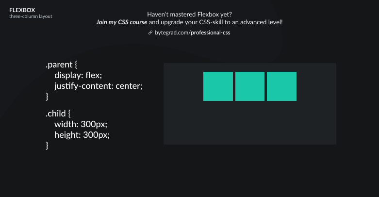
You're probably looking for one of the following three-column layouts with Flexbox:
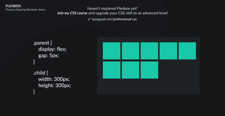
(examples don't contain irrelevant things for this topic like creating space between elements)
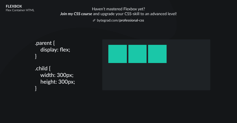
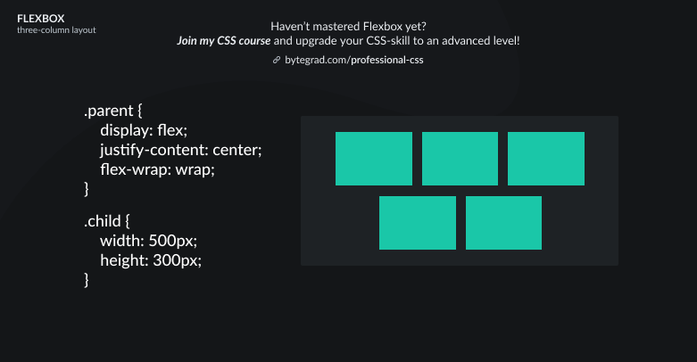
- A parent element with 3 child elements, like:
or
or
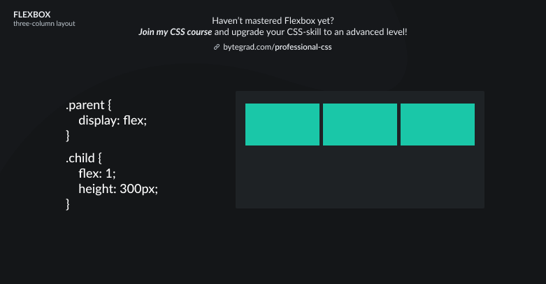
Note that with flex we specify the relative proportion each child element should get from the available space. Since all child elements have the same class of 'child', they all get flex: 1, so they should all take up the same proportion of the available space (they'll be the same width).
The flex property is about the width here, because the flex-direction here is 'row' (horizontal -- the default).
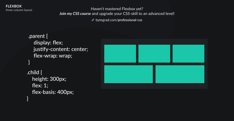
- A parent element and more than 3 child elements, like 6 or 9 or 12 (multiple of 3):
or
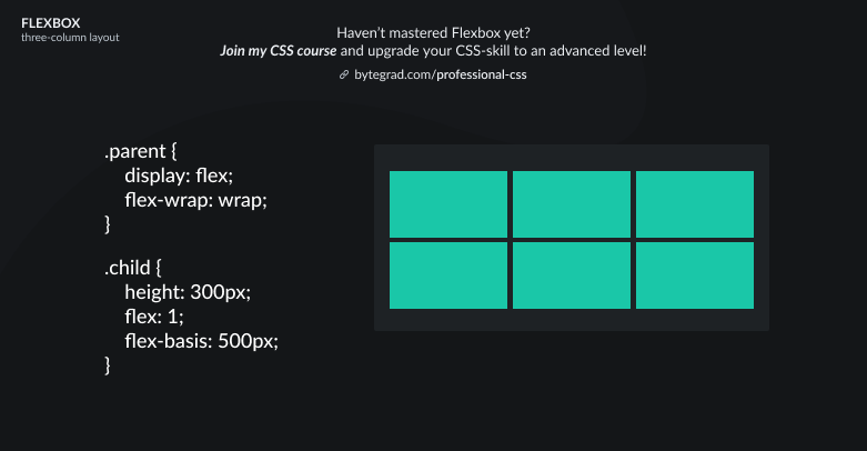
The flex-basis property acts as a minimum size. So the child elements all get at least 500px of width and then there is still some space left in the container (the 'available space'). The flex property then determines what proportion each child element should get from that available space.
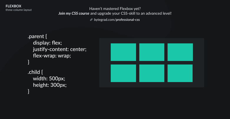
- A parent element and more than 3 child elements, like 5 or 10 or 41 (not a multiple of 3):
or
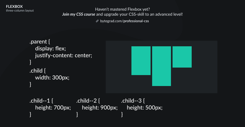
- A 'masonry' type of layout (a parent element with more than 3 child elements, no matter if a multiple of 3)
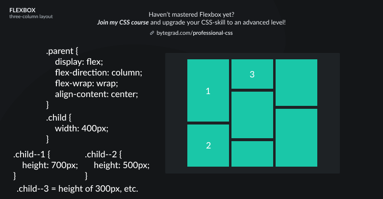
Here, we flip the direction to 'column' (vertical). Flex-items will flow vertically and if the next flex-item doesn't fit in the column it will wrap onto a new column.
Note that justify-content will behave differently now that we changed the flex-direction to column. We need to use align-content now if we want to horizontally center everything in the container (align-content instead of align-items because we have multiple columns here).
By the way, I think CSS is the 'bottleneck' to most websites & web apps. I believe it's the highest-ROI skill you can master.
Before I mastered CSS, I lost a ton of time & energy fiddling around with CSS.
I was learning about advanced JavaScript topics when I couldn't even implement basic layouts in CSS...
So I created a CSS course to help you avoid the same mistake. Check it out here if you're interested.
Would you like to be notified when I release a new course? You'll get early bird discounts. Sign up for my newsletter here.