CSS3 Border Box (Example + Illustration)
See the illustration to understand "box-sizing: border-box": the most difficult property in CSS3

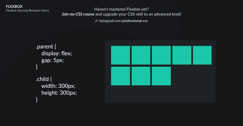
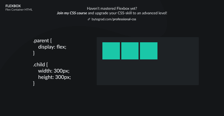
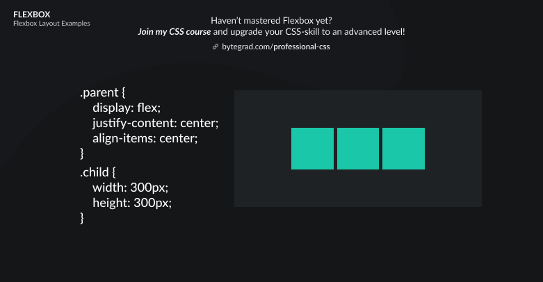
You need to master both Flexbox and CSS Grid in order to professionally build modern websites & web apps. If you haven't mastered both of them yet, I highly recommend going through my CSS Course.
To understand the "box-sizing: border-box" declaration in CSS3, see this illustration (open in new tab to see it bigger):
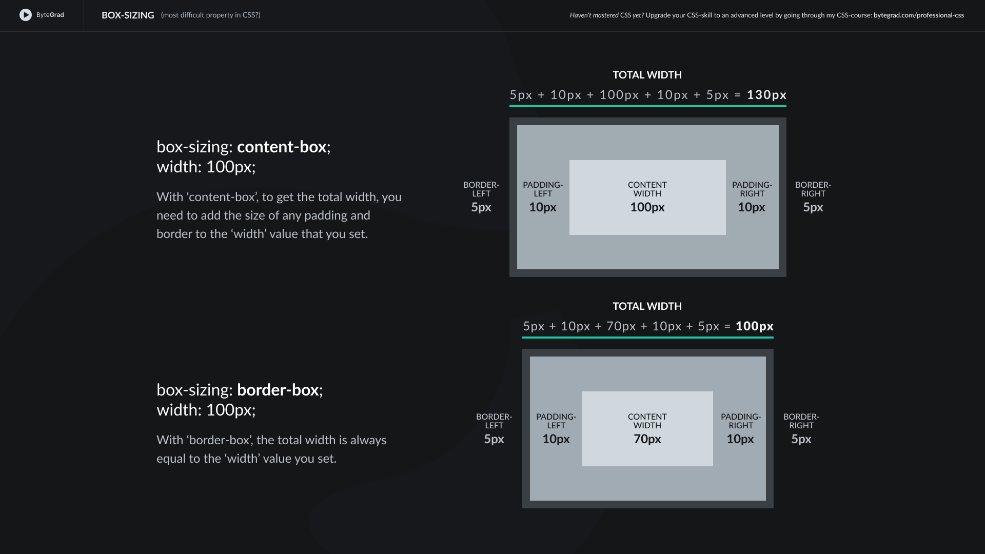
To fully understand it (this is the most difficult property in CSS), you should understand the box model in CSS.
Every HTML element has a box model. For example, this is a paragraph-element on some page:
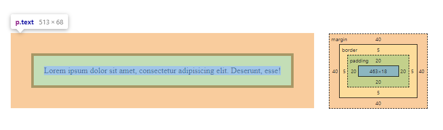
The blue color alone is the 'content-box'. The size of the content-box is simply determined by the space that the text takes up. So, if you have a lot of text or a large font-size, this will increase the content-box. But it is also influenced by the characteristics of the font that you use (e.g. how much space a certain character actually takes up).
The green PLUS the blue color is the 'padding-box'.
The yellow PLUS the green PLUS the blue color is the 'border-box'.
Around the border, there is margin. But margin is not considered to be part of an element, it's space between elements. So we don't have a 'margin-box'.
The tricky part in practice with this is when you set a width or height.
If you set width: 100px on some HTML-element, what exactly should be 100px? The content-box, padding-box or border-box?
The default is content-box. Which means if you set width: 100px on some HTML-element, and you also have some padding and/or a border, the TOTAL width is bigger than 100px.
For example, width: 100px is 100px for content PLUS 20px for left-side-padding + 20px for right-side-padding PLUS 5px for left-side-border + 5px for right-side-border = 150px width in TOTAL.
This is very confusing in practice, because when we set width: 100px on some HTML-element we expect that to be the TOTAL width of the element. At least, that would be much easier to work with.
So to make width: 100px the actual TOTAL width of the element, we use box-sizing: border-box. Now when you set a width (or height), the border-box is that width (or height).
For example, by setting width: 100px, the browser knows that the TOTAL width of the element should be 100px. So if we have 40px for left- and right-side padding + 10px for left- and right-side border, that means there is 50px left for the width of the content.
So the browser will force the width of the content to be 50px, making sure that the TOTAL width of the element is 100px.
And again, margin is not taken into account, because it's not considered part of an element, but space between elements.
Also, you will often see people use this in their CSS reset, like this simple reset:
*,
*::before,
*::after {
  margin: 0;
  padding: 0;
  box-sizing: border-box;
}
With the universal selector (*), we select all HTML elements except pseudo-elements, so we also select those individually with *::before and *::after.
Then set their box-sizing property to 'border-box', which is the only other option you have apart from the default 'content-box'.
By the way, I think CSS is the 'bottleneck' to most websites & web apps. I believe it's the highest-ROI skill you can master.
Before I mastered CSS, I lost a ton of time & energy fiddling around with CSS.
I was learning about advanced JavaScript topics when I couldn't even implement basic layouts in CSS...
So I created a CSS course to help you avoid the same mistake. Check it out here if you're interested.
Would you like to be notified when I release a new course? You'll get early bird discounts. Sign up for my newsletter here.
Also, I show projects of upcoming courses on social media, follow me here: