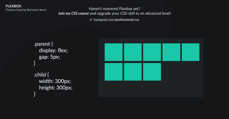
Flexbox Spacing Between Items: Examples
The illustrations will show how to create gutters between the flex-items
You need to master both Flexbox and CSS Grid in order to professionally build modern websites & web apps. If you haven't mastered both of them yet, I highly recommend going through my CSS Course.
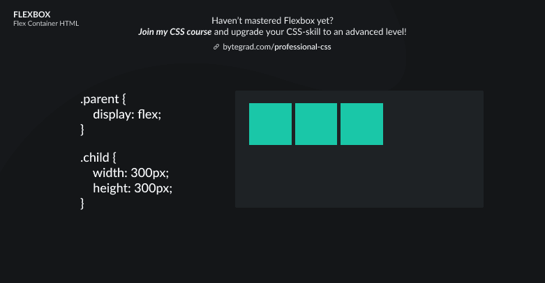
In the past, if you wanted to create space between flex-items, you had to use the good ol' margin property.
That came with certain issues, so today we have a better solution: the 'gap'-properties.
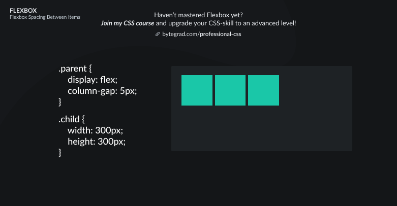
These actually come from CSS Grid, but since Flexbox and CSS Grid are being harmonized (so we can use the same properties in both systems) we can now also use these with Flexbox.
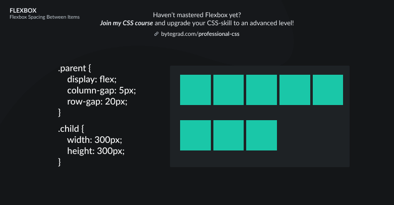
So there is column-gap:
And row-gap:
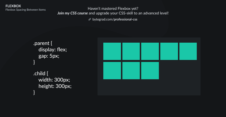
And gap:
These properties were previously called 'grid-column-gap', 'grid-row-gap' and 'grid-gap', but like I said, they're now available in Flexbox too so the 'grid-' prefix was dropped.
Note that the 'gap'-properties won't work properly in Internet Explorer.
By the way, I think CSS is the 'bottleneck' to most websites & web apps. I believe it's the highest-ROI skill you can master.
Before I mastered CSS, I lost a ton of time & energy fiddling around with CSS.
I was learning about advanced JavaScript topics when I couldn't even implement basic layouts in CSS...
So I created a CSS course to help you avoid the same mistake. Check it out here if you're interested.
Would you like to be notified when I release a new course? You'll get early bird discounts. Sign up for my newsletter here.
Also, I show projects of upcoming courses on social media, follow me here: