Flexbox Properties: Most Common + Rare Properties
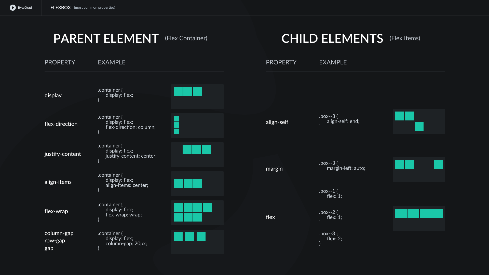
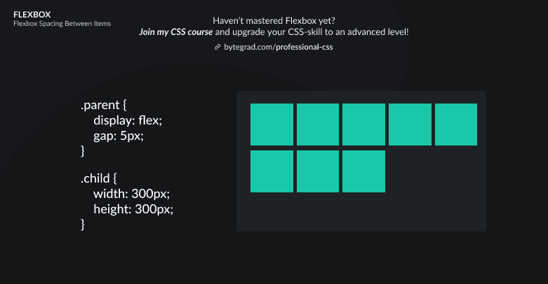
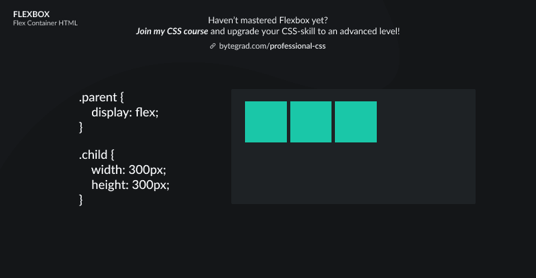
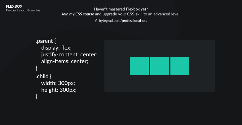
Example of the most common properties in CSS Flexbox

You need to master both Flexbox and CSS Grid in order to professionally build modern websites & web apps. If you haven't mastered both of them yet, I highly recommend going through my CSS Course.
Here's a list of the most common properties you will use in Flexbox (from my own experience) -- try opening in a new tab for bigger version:

Here's a list of more rare properties with a brief explanation:
align-content-- use this instead ofalign-itemswhen you have multiple rows/columns (which you will have when flex-items have wrapped onto new lines).order-- use this to change the order of flex-items. This is something you want to do sometimes when you make your project responsive. Some flex-item may then fall below another flex-item, because limited space on e.g. mobile forces everything into a 1-column layout, and you don't want that flex-item to sit below another one. This property works with a number, the lowest numbers come first in the order.
By the way, I think CSS is the 'bottleneck' to most websites & web apps. I believe it's the highest-ROI skill you can master.
Before I mastered CSS, I lost a ton of time & energy fiddling around with CSS.
I was learning about advanced JavaScript topics when I couldn't even implement basic layouts in CSS...
So I created a CSS course to help you avoid the same mistake. Check it out here if you're interested.
Would you like to be notified when I release a new course? You'll get early bird discounts. Sign up for my newsletter here.
Also, I show projects of upcoming courses on social media, follow me here:


