Flexbox No Wrap Explained (Example)
See illustration to understand Flexbox no wrap

You need to master both Flexbox and CSS Grid in order to professionally build modern websites & web apps. If you haven't mastered both of them yet, I highly recommend going through my CSS Course.
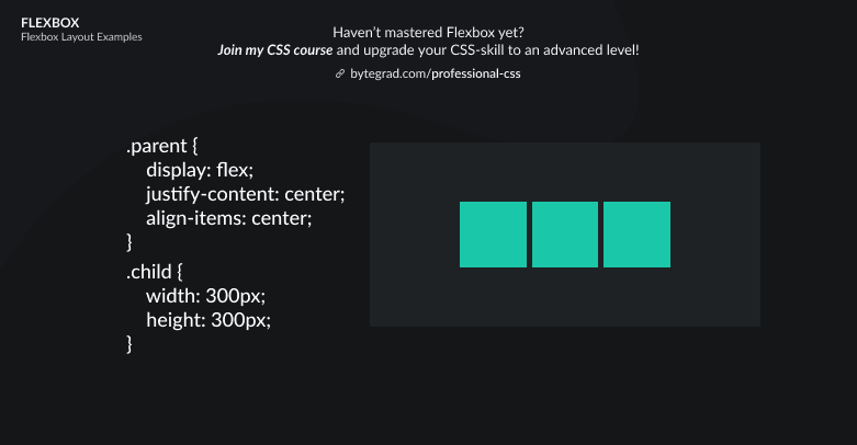
Using Flexbox with a few flex-items is straightforward:
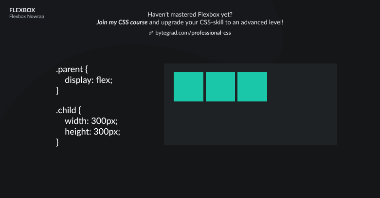
But now let's say you have many flex-items or very large flex-items that don't really fit on the same line, what happens? Well, they will flow outside the flex-container:
This is because the default is flex-wrap: nowrap.
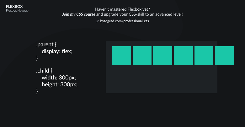
I actually don't know why this is the default value, I think most of the time you want them to wrap onto a new line:
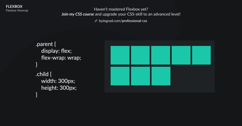
Simply use flex-wrap: wrap to achieve this.
By the way, I think CSS is the 'bottleneck' to most websites & web apps. I believe it's the highest-ROI skill you can master.
Before I mastered CSS, I lost a ton of time & energy fiddling around with CSS.
I was learning about advanced JavaScript topics when I couldn't even implement basic layouts in CSS...
So I created a CSS course to help you avoid the same mistake. Check it out here if you're interested.
Would you like to be notified when I release a new course? You'll get early bird discounts. Sign up for my newsletter here.
Also, I show projects of upcoming courses on social media, follow me here: