Flexbox Align Content: Examples
See the illustrations to finally understand the 'align-content' property
You need to master both Flexbox and CSS Grid in order to professionally build modern websites & web apps. If you haven't mastered both of them yet, I highly recommend going through my CSS Course.
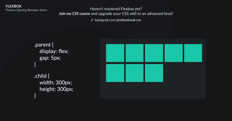
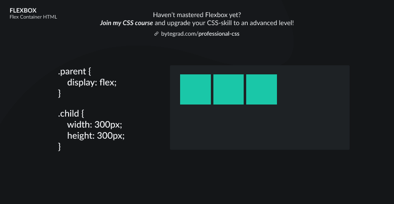
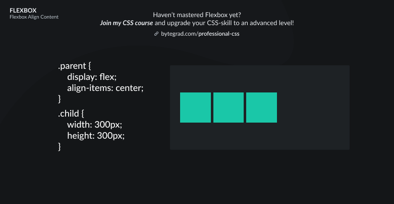
Let's start with the default layout in Flexbox:

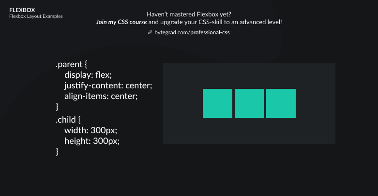
If we want to center all of these flex-items vertically, we can simply use align-items: center:
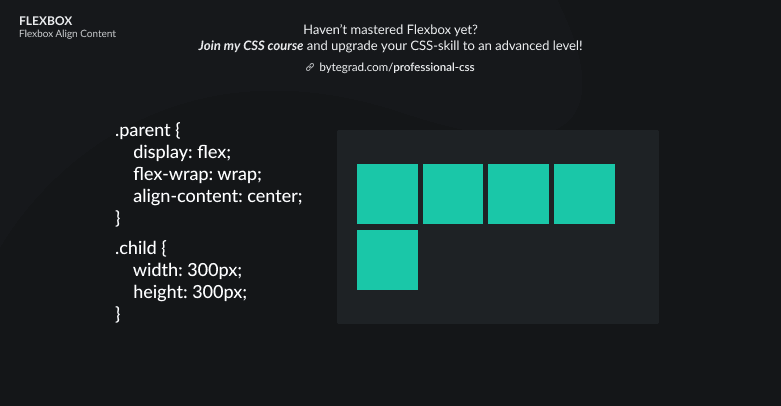
However, what happens if we have many more flex-items? Or flex-items that are much bigger? Then we probably want them to wrap onto new lines if they don't fit:
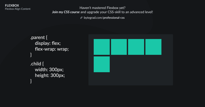
Now, how do we vertically center all flex-items properly like before?
We have to use align-content:

Conclusion: use align-items when you have just 1 row (or 1 column, in case you use flex-direction: column), use align-content when your flex-items have wrapped onto new lines so that you have more than 1 row or 1 column.
By the way, I think CSS is the 'bottleneck' to most websites & web apps. I believe it's the highest-ROI skill you can master.
Before I mastered CSS, I lost a ton of time & energy fiddling around with CSS.
I was learning about advanced JavaScript topics when I couldn't even implement basic layouts in CSS...
So I created a CSS course to help you avoid the same mistake. Check it out here if you're interested.
Would you like to be notified when I release a new course? You'll get early bird discounts. Sign up for my newsletter here.
Also, I show projects of upcoming courses on social media, follow me here: