CSS Flexbox Row: Explained (+ Example)
See illustration to understand CSS Flexbox row

You need to master both Flexbox and CSS Grid in order to professionally build modern websites & web apps. If you haven't mastered both of them yet, I highly recommend going through my CSS Course.
The crucial thing to understand about Flexbox is that you always work with 1 direction: either the horizontal (row) or vertical (column) direction.
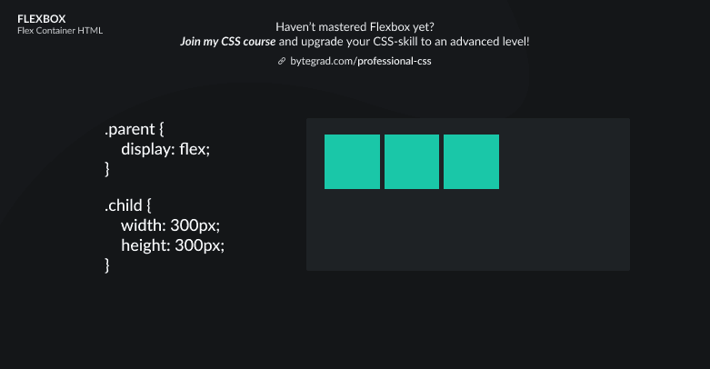
The default is the horizontal (row) direction. In CSS, that means the flex-direction property has a default value of row.
So what you will get as a default is this:

Flex items will be laid out along a row (horizontally), next to each other. Note that you don't have to set the flex-direction property to row yourself to achieve this, it's already done for you (default value).
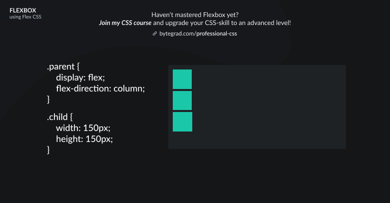
If you don't want a row layout but a column layout, you can change the flex-direction property to column:
By the way, I think CSS is the 'bottleneck' to most websites & web apps. I believe it's the highest-ROI skill you can master.
Before I mastered CSS, I lost a ton of time & energy fiddling around with CSS.
I was learning about advanced JavaScript topics when I couldn't even implement basic layouts in CSS...
So I created a CSS course to help you avoid the same mistake. Check it out here if you're interested.
Would you like to be notified when I release a new course? You'll get early bird discounts. Sign up for my newsletter here.
Also, I show projects of upcoming courses on social media, follow me here: