CSS Flex Align Vertical: Tutorial (Examples + Illustrations)
See the illustrations to understand vertically aligning flex-items in Flexbox

You need to master both Flexbox and CSS Grid in order to professionally build modern websites & web apps. If you haven't mastered both of them yet, I highly recommend going through my CSS Course.
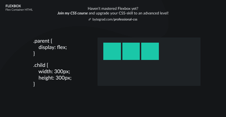
To understand vertical aligning in Flexbox, let's start from the default layout in Flexbox:

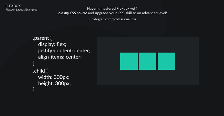
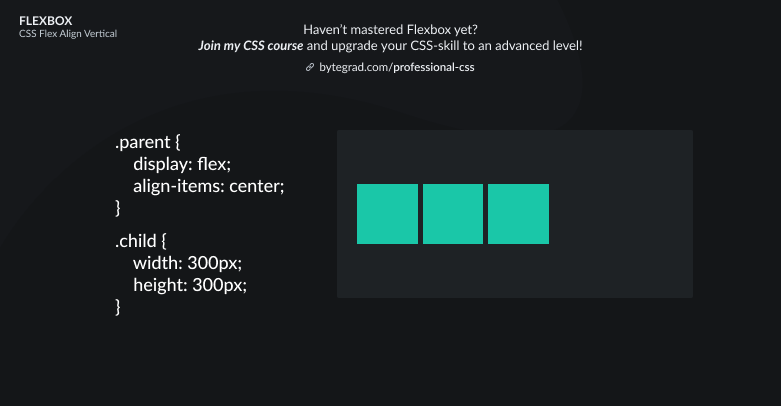
We can use align-items to determine where along the vertical axis all flex-items should sit. For example, if we want them to sit in the center:
Or maybe we want them all to sit at the bottom:
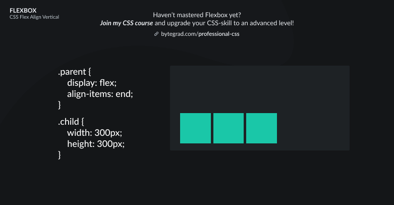
Note that we used the value 'end' here, but 'flex-end' still has better browser support. However, 'flex-end' is being phased out and the future is 'end'. This is because Flexbox and CSS Grid are being harmonized so that we can use the same properties in both systems, so the 'flex-' and 'grid-' prefixes are being dropped.
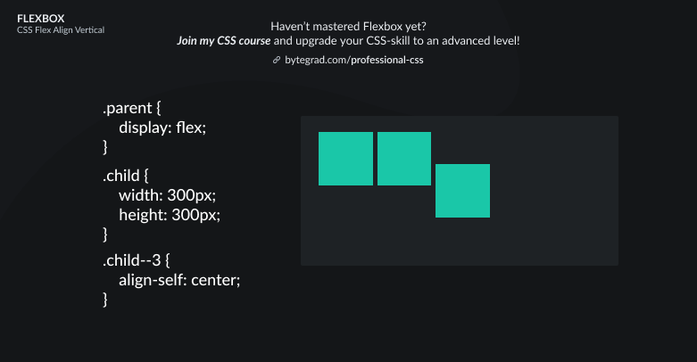
This was for aligning ALL flex-items vertically, but what if we just want to vertically align an individual flex-item? We can use align-self for that:
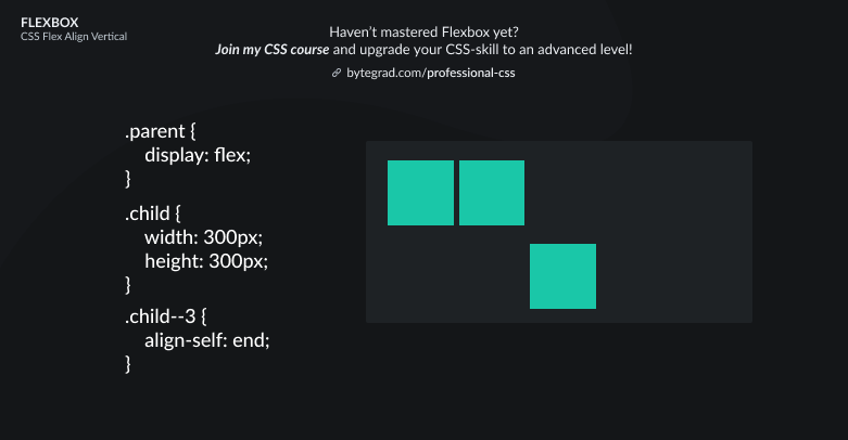
Or use align-self: end to make it sit at the bottom:
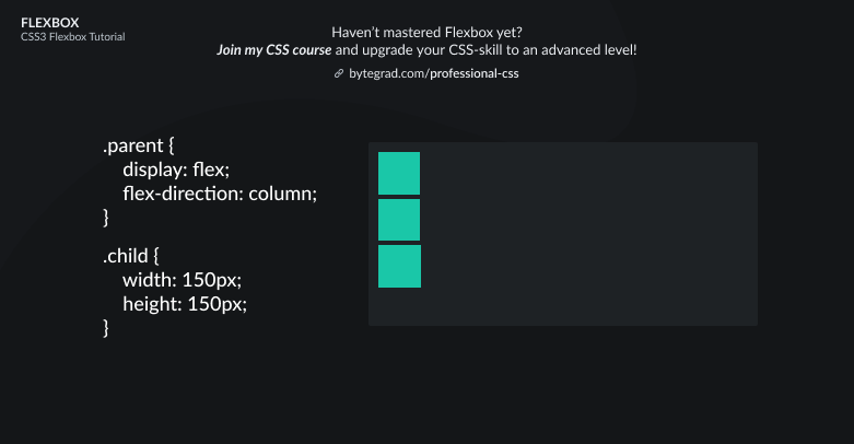
Note that when you use flex-direction: column, the 'align'-properties will now work for the horizontal axis instead of the vertical axis.
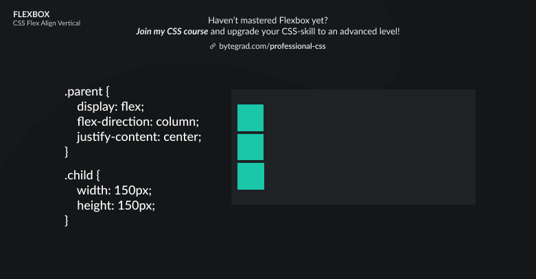
This is the default layout when you use flex-direction: column:
Then you need to use justify-content to do vertical alignment for all flex-items:
Or for 1 individual flex-item, use 'margin' with 'auto':
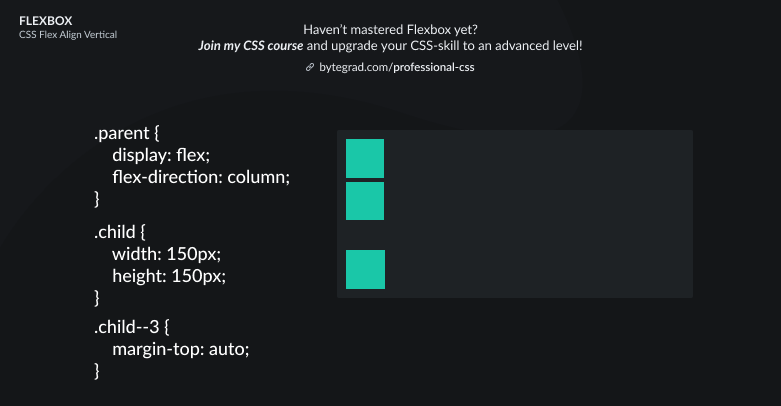
The margin will now take up the space on top of the selected element, pushing itself downwards.
So there is no 'justify-self' property in Flexbox, because 'margin: auto' already takes care of what we want. Which is a bit confusing... I wish we had 'justify-self' in Flexbox.
By the way, I think CSS is the 'bottleneck' to most websites & web apps. I believe it's the highest-ROI skill you can master.
Before I mastered CSS, I lost a ton of time & energy fiddling around with CSS.
I was learning about advanced JavaScript topics when I couldn't even implement basic layouts in CSS...
So I created a CSS course to help you avoid the same mistake. Check it out here if you're interested.
Would you like to be notified when I release a new course? You'll get early bird discounts. Sign up for my newsletter here.