Make Flex-Items Wrap Onto a New Column
Use Flexbox in CSS to create multiple columns

You need to master both Flexbox and CSS Grid in order to professionally build modern websites & web apps. If you haven't mastered both of them yet, I highly recommend going through my CSS Course.
You need to use flex-direction: column together with flex-wrap: wrap to make flex-items wrap onto a new column. Here's an example from another article I wrote:
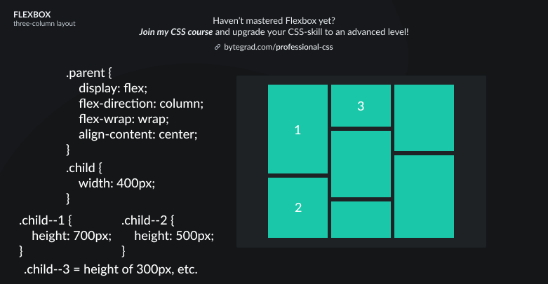
That's because Flexbox works with 1 direction: either horizontal (row) or vertical (column).
The default is horizontal (row), so when there is not enough space left for an additional flex-item it will wrap onto a new row (if you have set flex-wrap to wrap, otherwise it will overflow the container).
To change the direction to vertical (column), set flex-direction to column. Then, when there is not enough space left for an additional flex-item it will wrap onto a new column (if you have set flex-wrap to wrap, otherwise it will overflow the container).
By the way, I think CSS is the 'bottleneck' to most websites & web apps. I believe it's the highest-ROI skill you can master.
Before I mastered CSS, I lost a ton of time & energy fiddling around with CSS.
I was learning about advanced JavaScript topics when I couldn't even implement basic layouts in CSS...
So I created a CSS course to help you avoid the same mistake. Check it out here if you're interested.
Would you like to be notified when I release a new course? You'll get early bird discounts. Sign up for my newsletter here.
Also, I show projects of upcoming courses on social media, follow me here: