CSS3 Flexbox: Complete Tutorial for Beginners (Examples & Illustrations)
See illustrations to understand Flexbox in CSS3

You need to master both Flexbox and CSS Grid in order to professionally build modern websites & web apps. If you haven't mastered both of them yet, I highly recommend going through my CSS3 Course.
There are 2 major options in CSS3 to implement layouts: Flexbox & CSS Grid.
Flexbox is the one you want to use more frequently, in my experience.
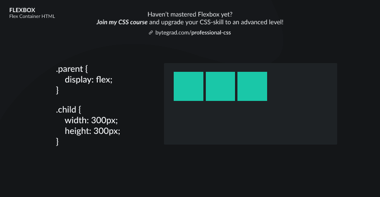
It all starts by setting display: flex on a parent element:

This is the default layout: flex-items will be sitting on the same row next to each other.
Now we have 'unlocked' the Flexbox functionalities.
The element with display: flex is called the flex-container and its direct child elements are called the flex-items.
We can now use some Flexbox properties on both the flex-container and flex-items individually.
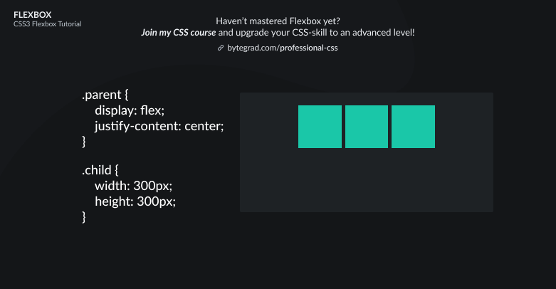
Let's say we want to center all flex-items horizontally. The justify-content property is used here for horizontal alignment:
Or maybe we want it to sit at the end, horizontally:
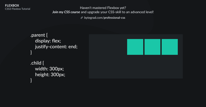
Note that you can also use 'flex-end' instead of 'end'. Flex-end still has better browser support, but the future is 'end' (the properties across Flexbox and CSS Grid are being harmonized -- i.e. the 'flex-' and 'grid-' prefixes will be removed so we have the same properties in both Flexbox & CSS Grid).
So justify-content is for horizontal alignment here, now we also want to look at vertical alignment. We can use align-items for that:
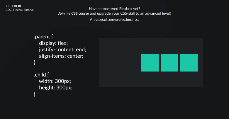
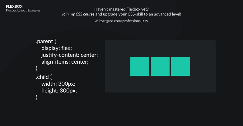
Or if we want the flex-items to be centered both horizontally and vertically:

Okay, so we used justify-content for horizontal alignment and align-items for vertical alignment.
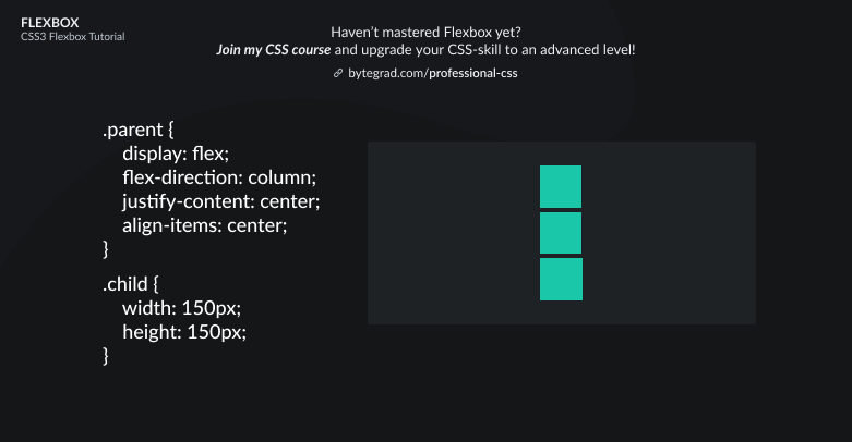
Important to understand about Flexbox is that you always work with 1 direction. So the flex-items will always follow 1 particular direction. The default is horizontal (row).
But we can also change the direction to vertical (column):
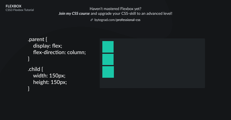
We used flex-direction: column to change the direction.
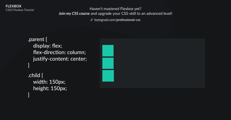
The tricky part about this is now that justify-content and align-items flip.
Justify-content is now for the vertical axis and align-items for the horizontal axis.
Centering the flex-items vertically with justify-content now:
And to center them horizontally too, use align-items now:
This was all for aligning ALL flex-items, but what if we just want to position 1 flex-item in a particular way? Let's go back to the default layout in Flexbox:
So in the default layout, we can use 'align-items' for the vertical alignment. That's for ALL flex-items.
Now we want to align 1 flex-item along the vertical axis. We can do that with align-self:
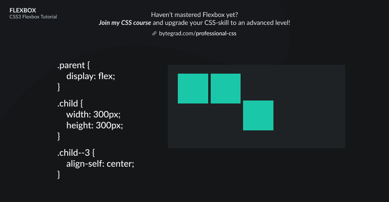
So just select the individual flex-item and use align-self.
That's for the vertical axis. How can we align an individual flex-item along the horizontal axis? Is there a 'justify-self' property as well?
The answer is no. We actually have to use the margin property with value auto:
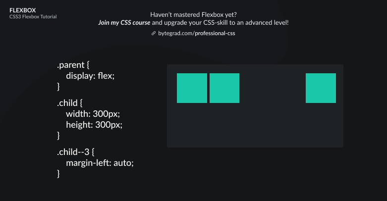
So here the margin will take up all the space to the left of the selected flex-item, pushing itself to the right.
Note that also for individual alignment their functionalities switch sides when you use flex-direction: column.
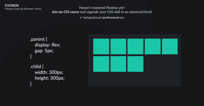
To create the gaps between flex-items, you can use the gap properties: column-gap, row-gap and gap. I didn't include it here to keep things simple, so I cheated a bit with the gap in the illustrations.
By the way, I think CSS is the 'bottleneck' to most websites & web apps. I believe it's the highest-ROI skill you can master.
Before I mastered CSS, I lost a ton of time & energy fiddling around with CSS.
I was learning about advanced JavaScript topics when I couldn't even implement basic layouts in CSS...
So I created a CSS course to help you avoid the same mistake. Check it out here if you're interested.
Would you like to be notified when I release a new course? You'll get early bird discounts. Sign up for my newsletter here.
Also, I show projects of upcoming courses on social media, follow me here: