


Flexbox Layout Examples: Most Common Layouts
The layouts you will use 99% of the time in CSS


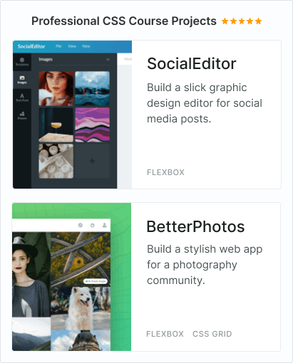
You need to master both Flexbox and CSS Grid in order to professionally build modern websites & web apps. If you haven't mastered both of them yet, I highly recommend going through my CSS Course.
This is the default layout in Flexbox:
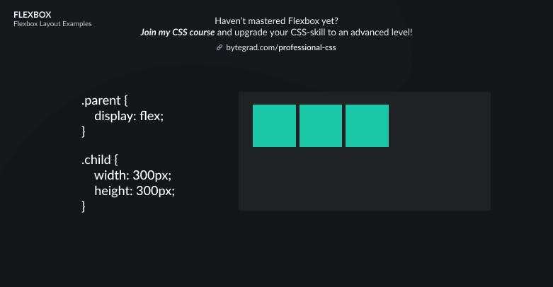
You set display: flex on an element. This makes that element the so-called flex-container and its direct child elements the so-called flex-items.
The flex-items are laid out horizontally next to each other, starting from the top-left corner.
Sometimes this is all you need.
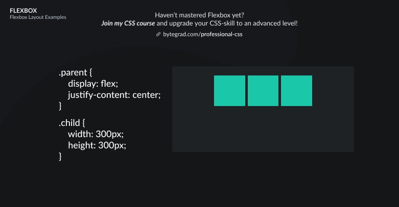
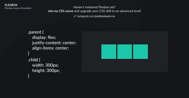
However, let's say we want to position these flex-items differently. We have 2 major options: we can position them along the horizontal axis or the vertical axis.
To position the flex-items along the horizontal axis, use justify-content here:
or
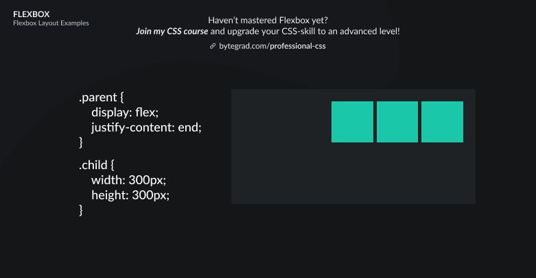
Note that flex-end has better browser support at time of writing, but is being phased out in favor of end. This is because Flexbox and CSS Grid properties are being harmonized, so we can use the same properties in both systems. That's why the 'flex-' and 'grid-' prefixes are being dropped.
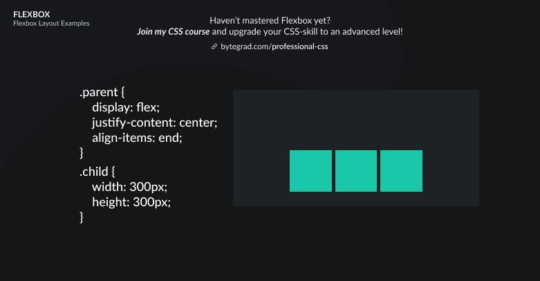
We can also align the flex-items vertically with align-items:
or
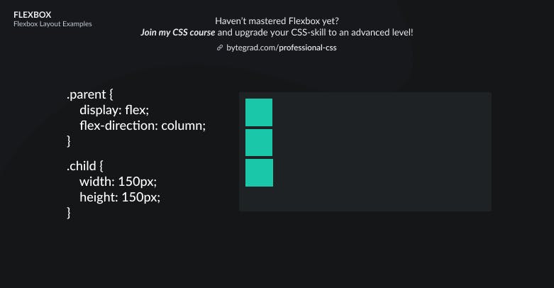
With Flexbox, the flex-items are always laid out along 1 direction: horizontal (row) or vertical (column). The default is horizontal (row).
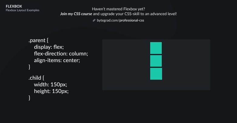
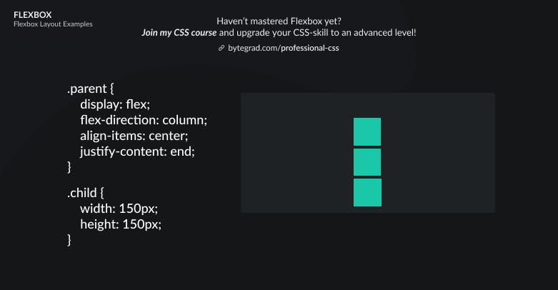
However, sometimes we want it to be vertical (column):
When you do that, the align-items and justify-content properties 'flip', so now justify-content works for the vertical axis and align-items for the horizontal axis:
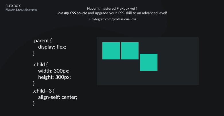
Sometimes, we only want to position 1 flex-item in a certain way, not all flex-items. We can do that by selecting that individual flex-item and using align-self instead of align-items:
For the other axis, there is no justify-self. Instead we should use margin: auto:
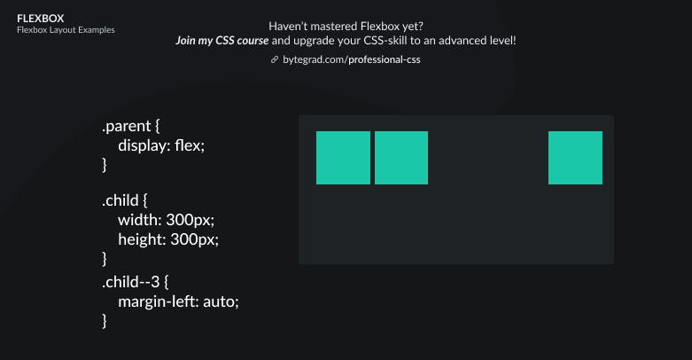
Here, margin will take up all the space left to the flex-item, pushing the flex-item itself all the way to the right.
Sometimes, you will have more flex-items than here or just a few very large ones. In that case, they may overflow the container or stretch the container out. Instead of that, you probably want them to wrap onto a new line if they don't fit.
Use flex-wrap: wrap to do that:
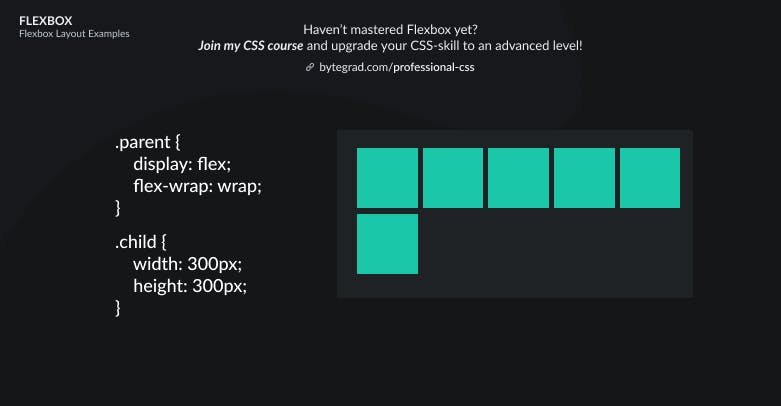
Here we have multiple rows now. If we want to center all of this vertically like before, we now have to use align-content instead of align-items:
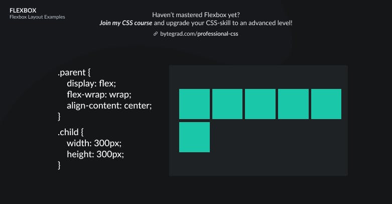
So use align-items when you have 1 row or column, use align-content when you have multiple rows or columns (after wrapping).
By the way, I think CSS is the 'bottleneck' to most websites & web apps. I believe it's the highest-ROI skill you can master.
Before I mastered CSS, I lost a ton of time & energy fiddling around with CSS.
I was learning about advanced JavaScript topics when I couldn't even implement basic layouts in CSS...
So I created a CSS course to help you avoid the same mistake. Check it out here if you're interested.
Would you like to be notified when I release a new course? You'll get early bird discounts. Sign up for my newsletter here.
Also, I show projects of upcoming courses on social media, follow me here: