

Flexbox Examples: Most Common Layouts (+ Illustrations)
Check out the illustrations to learn the layouts you want 99% of the time in CSS


You need to master both Flexbox and CSS Grid in order to professionally build modern websites & web apps. If you haven't mastered both of them yet, I highly recommend going through my CSS Course.
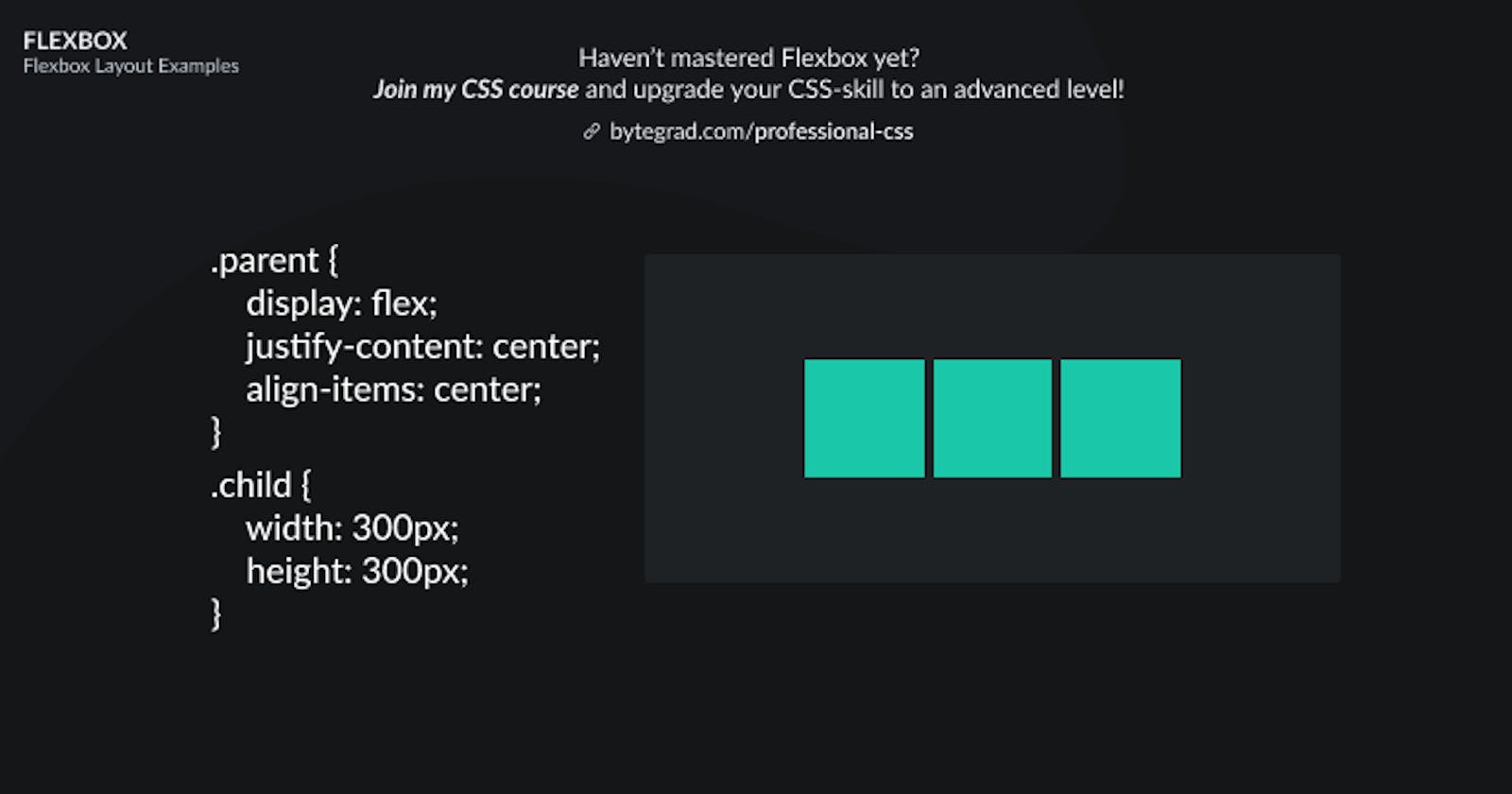
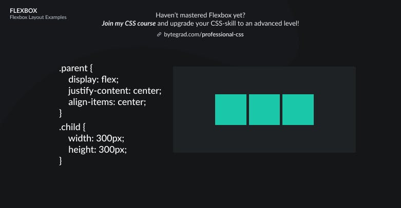
To 'unlock' the functionalities of Flexbox, simply pick an element and use display: flex:
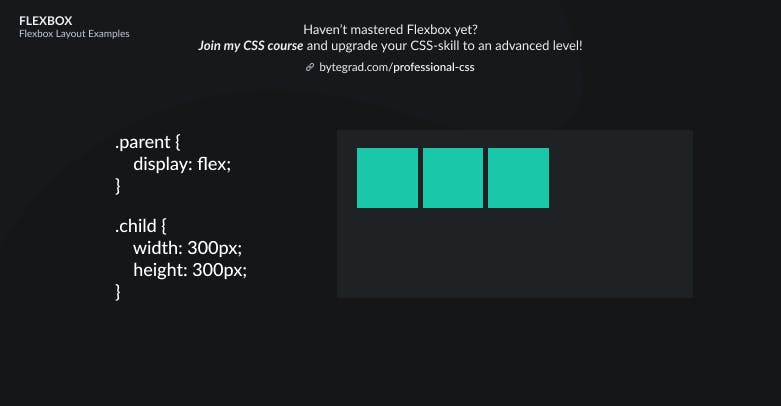
This will give you the default layout.
The element with display: flex is the flex-container and its direct child elements are called the flex-items.
The flex-items are laid out horizontally next to each other in the default layout.
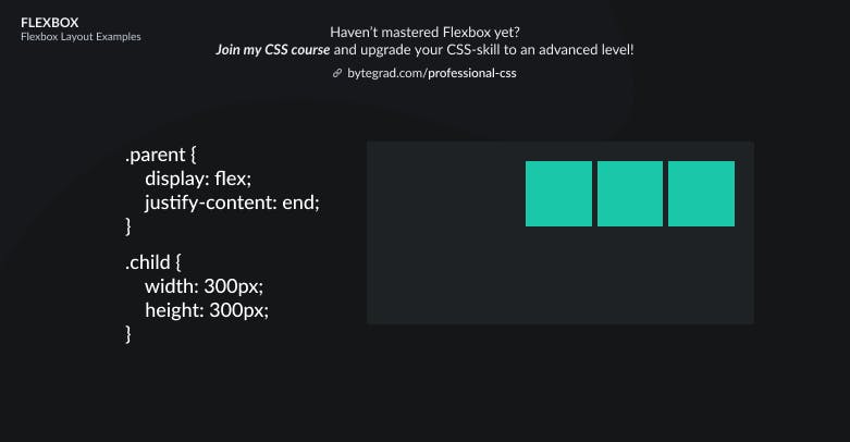
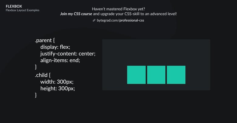
We can position these flex-items somewhere else, horizontally or vertically.
For example, horizontally we can do this by using justify-content:

And vertically we can use align-items:
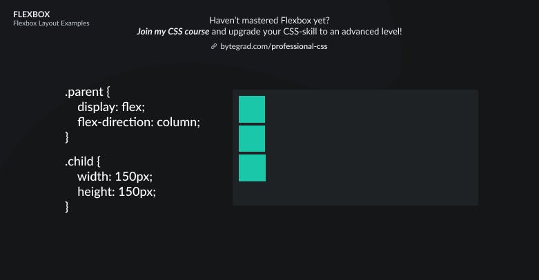
Notice how the flex-items now always flow horizontally, they go from left to right.
Sometimes we want them to flow vertically, from top to bottom.
We can do that with flex-direction: column:
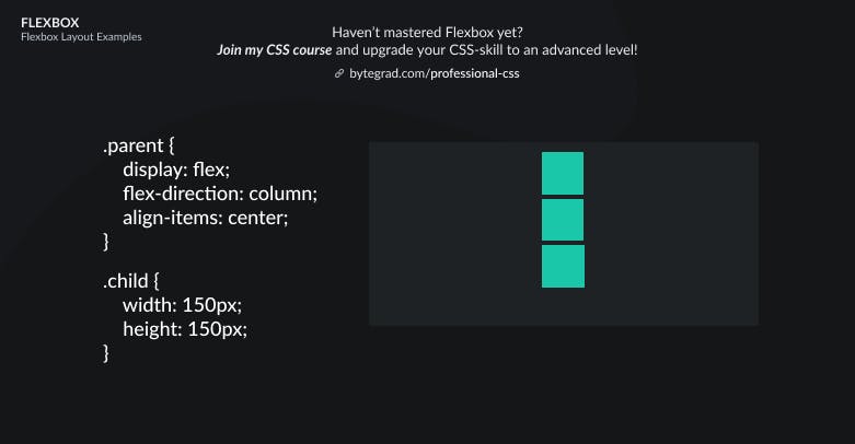
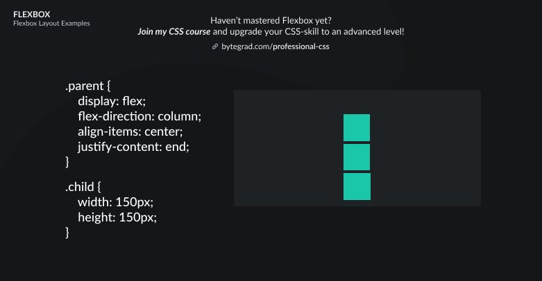
Then we can use justify-content and align-items again to position them differently, however now their axes have 'flipped'.
So now you need to use justify-content for the vertical axis and align-items for the horizontal axis:
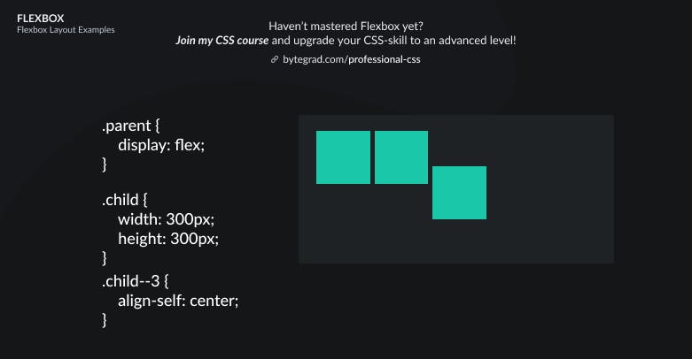
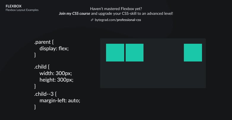
Sometimes we just want to move 1 flex-item to a different position.
Select that one element and use align-self or margin: auto:
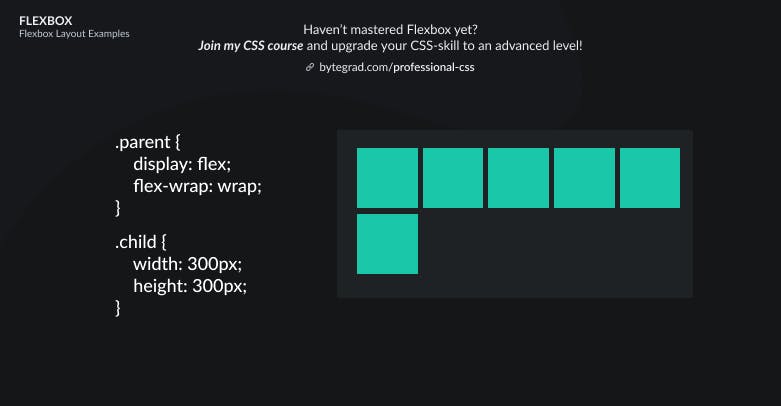
Also, if you have many flex-items or very large flex-items such that they do not fit, they will overflow the container or stretch the container out. You can make them wrap with flex-wrap: wrap:
And now if you want to position everything along the vertical axis, you should use align-content instead of align-items (use align-content when you have multiple rows/columns like we have now after wrapping):
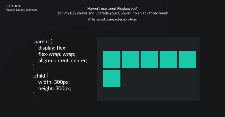
I cheated a bit in the illustrations by giving the flex-items some space between them. In practice you need to use one of the gap properties to achieve that: column-gap, row-gap or gap.
By the way, I think CSS is the 'bottleneck' to most websites & web apps. I believe it's the highest-ROI skill you can master.
Before I mastered CSS, I lost a ton of time & energy fiddling around with CSS.
I was learning about advanced JavaScript topics when I couldn't even implement basic layouts in CSS...
So I created a CSS course to help you avoid the same mistake. Check it out here if you're interested.
Would you like to be notified when I release a new course? You'll get early bird discounts. Sign up for my newsletter here.
Also, I show projects of upcoming courses on social media, follow me here: